Data helps us to make sense of our world. We draw meaning, find patterns, make associations, create maps and models which help us get insights, understand trends, and make informed decisions. We seek and remember the stories that data tells. But the large volume and complexity of data can be difficult for our brains to comprehend and process. That’s where visual elements such as tables, charts, and graphs provide powerful representations of huge amounts of data points that the human brain can process.
A well made and designed data visualization portrays a large amount of complex information using relatively little space and by taking advantage of our visual system. This is why data visualization is one of the most convincing methods to share the various kinds of data that is extracted from all the systems available to us today.
The importance of data visualization is even more pronounced in light of ever-decreasing attention spans. Let’s understand the psychology behind data visualizations a little deeper.
How data visualizations help us understand data
The effectiveness of data visualization is its ability to represent information in a manner that our eyes can recognize and our brains can understand. Getting this right is more of a science than an art, which we can achieve by studying human perception. The goal is to translate abstract information into visual representations that can be easily, efficiently, accurately, and meaningfully understood. To achieve this goal, a well made and designed representation must be able to attain the following:
- Clearly indicate how values relate to one another.
- Represent the values accurately.
- Make it easy to compare values.
- Make it easy to rank and order the values.
- Make it obvious how people should use this information, what they should use it to accomplish, and encourage them to follow through.
In other words, we should always judge a visualization’s merits by the degree to which we can easily, efficiently, accurately, and meaningfully perceive the story that the information has to tell.
Data visualization for human perception
Data visualization is the translation and graphical display of abstract numerical and statistical information into physical attributes of vision (length, position, size, shape, and color, to name a few) for purposes of communication, decision-making and data analysis. We can only succeed at this if we understand a bit about visual perception and cognition. In other words, to visualize data effectively, we must follow design principles that are derived from an understanding of human perception.
As the saying goes, “a picture is worth a thousand words”; this is true when a story is told graphically, with a strong design, instead of verbally. For example, you could stare at a table of numbers all day and never see what would otherwise be very obvious to notice while looking at the same numbers graphically well represented.
While words and numbers can express values precisely, pictures or graphic representations have the power of allowing us to look for and highlighting patterns, trends, or exceptions among these values. This is important if we want a quick sense of the story contained in these values, or if we need to compare whole sets and large amounts of values rather than just two at a time. Alpha numerical data, such as text in a table, are interpreted by our brains through the use of verbal processing. This does not always communicate as effectively to us as data that is communicated visually, which our brains are able to easily understand and interpret. This is the power of data visualization.
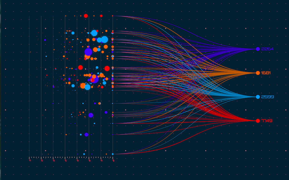
Although data visualization usually features relationships between quantitative values, it also has the capability of displaying relationships that are not quantitative in nature. For instance, the connections between people on a social networking site can be displayed using a node and link visualization. However, visualizations that feature relationships between entities, such as the people in this example, can be enriched with the addition of quantitative information as well. For example, the number of times that any two people have interacted could be represented by the thickness of the line that connects them.
How the brain processes data visualizations
Data visualizations are so effective because they shift the balance between perception and cognition to take better advantage of the brain’s abilities. Seeing (visual perception), which is handled by the visual cortex located in the rear of the brain, is extremely fast and efficient. Thinking (cognition), on the other hand, which is handled predominantly by the cerebral cortex in the front of the brain, is much slower and less efficient. This means traditional data sense-making and presentation methods require conscious thinking for almost all of the work. However, data visualization shifts the balance towards significant use of visual perception, taking advantage of our eyes and speed of seeing.
What is the dual processing theory
You might have heard about the dual processing theory, which categorizes human thinking into two systems or types — system 1 and system 2 thinking. System 1 or type 1 is the fast and instinctual decision-making. It does not require working memory and is autonomous. System 2 or type 2, on the other hand, is the slow and rational decision-making, which requires working memory and is not autonomous. It requires mental or cognitive stimulation.
Actions derived by system 1 thinking are usually an outcome of the individual’s emotions. Similarly, the immediate grasp of complex information in a data visualization is also related to system 1 thinking because a large part of our brain is dedicated to visual processing. It is instinctual and it is immediate, driven by emotion.
Why data visualizations help us to understand faster
Our brain has the capability of detecting shape, color and motion separately which allows our audience to understand, make associations and identify dimensions in data visualizations almost instantaneously. Designing data visualizations that incorporate pre-attentive features make them much more effective thanks to pre-attentive processing, which is the subconscious accumulation of information from the environment, where all the available information is pre-attentively processed. Then, the brain filters and processes what is important. Information that stands out the most or is of most relevance to what a person is thinking about is selected for further and more complete analysis by attentive processing.
Pre-attentive features are processed very quickly, within around 10 milliseconds. To put it simply, the better designed and thoughtfully created the data visualization, the more understandable it is, the more information it can represent and the faster it is to read and register. Considering the speed at which people can understand multiple data points through the dual processing theory and pre-attentive processing, it is wise to take advantage of data visualization.
Effective data visualization
Some of the earliest contributions to the science of perception came from the Gestalt School of Psychology. One of their earliest studies, in 1912, was to discover how humans perceive pattern, form, and organization in what we see. They observed that we organize what we see in particular ways in an effort to make sense of it. The result was the Gestalt principles of perception, which are still respected today as accurate descriptions of visual behavior and can considerably enhance our data visualization efforts:
- Proximity – objects that are close together are perceived as a group.
- Similarity – objects that share similar attributes (e.g., color or shape) are perceived as a group.
- Enclosure – objects that appear to have a boundary around them (e.g., formed by a line or area of common color) are perceived as a group.
- Closure – open structures are perceived as closed, complete, and regular whenever there is a way that they can be reasonably interpreted as such.
- Continuity – objects that are aligned together or appear to be a continuation of one another are perceived as a group.
- Connection – objects that are connected (e.g., by a line) are perceived as a group.
Apart from simply presenting the data in a visual form, data visualization must also provide cues which assist the user to reach a final decision, without actually spelling out the decision. It can take tremendous effort to gather, sort, analyze and obtain insights and trends from the data that needs to be visualized. But if your analysis is sound, and if your insights and trends are enlightening, then you do not want to confuse your users with a disorganized data visualization.
A data visualization is only as impactful as its design. To bring value to a data visualization, it must provide simplicity, clarity, intuitiveness, insightfulness and highlight patterns in a collaboration-enabling manner, while supporting the requirements and decision objectives of the users.
Here are five qualities of data visualization that are most appealing and impactful to users, that can shift their way of thinking and give clarity on what actions to take next:
- Truthful – It should be based on thorough and objective research.
- Functional – It should be accurate and allow your users to act upon your information.
- Beautiful – It needs to be well-designed and draw the user’s attention through an aesthetically pleasing display of information.
- Insightful – It needs to provide information like trends, insights, and inferences that would be difficult to see otherwise.
- Enlightening – It needs to highlight your evidence, tell a story and enlighten users with your information in a way that is easy to understand.
It is important to know these aspects of human perception and cognition. By better understanding how the human brain processes information and the psychology behind data visualizations, we can make our visualizations even more effective.


1 thought on “The Psychology Behind Data Visualization”
Comments are closed.