Data is power. While we apply the power of data visualization to various aspects of our business operations, it’s interesting to look at the way in which data visualization is impacting the world, and how it came to doing so.
Here is a list of the most compelling data visualization statistics, facts and history:
- Statistics that prove the power of data visualization:
- 90% of the information transmitted to the brain is visual – (Source: MIT)
- The human brain can process an image in just 13 milliseconds – (Source: MIT)
- 50% of the brain is active in visual processing – (Source: Piktochart)
- Human brains process visuals 60,000 times faster than they do text – (Source: University of Minnesota)
- 93% of communication is nonverbal – (Source: Ubiquity)
- High-quality infographics are 30 times more likely to be read than plain text – (Source: Kissmetrics)
- People who follow directions with illustrations do 323% better than those who follow text-only directions – (Source: Springer Link)
- If a scientific claim is presented in pure words or numbers, 68% of people will believe that the information is accurate and truthful. But if you put a simple graph with the claim, the number rises to 97% (Source: Cornell University)
- The Wharton School of Business found that while only half of an audience was convinced by a purely verbal presentation, that number jumped to over two thirds when visuals were added – (Source: American Management Association)
- The same Wharton School of Business study found that the use of data visualizations could shorten business meetings by 24% – (Source: American Management Association)
- Managers in organizations with visual data recovery tools are 28% more likely to find timely information than those who rely on managed reporting and dashboards – (Source: Tableau)
- What’s more, 48% of these managers can find the data they need without the help of I.T. staff – (Source: Tableau)
- Companies with the most advanced analytics capabilities are:
- 2 times more likely to be in the top quartile of financial performance within their industries
- 2 times more likely to use data very frequently when making decisions
- 3 times more likely to execute decisions as intended
- 5 times more likely to make decisions much faster than market peers (Source: Bain & Company)
- The size of the data visualization market
The global data visualization market was valued at USD 4.51 billion in 2017 and is expected to reach a value of USD 7.76 billion by 2023, at a Compound Annual Growth Rate (CAGR) of 9.47% over the period 2018-2023. This shows the growing acceptance and importance of data visualization in every field and its positive impact on our lives to better represent and highlight complex information. - 8% of the population may have trouble seeing your visualizations
A 2016 report from the National Health Interview Survey estimated that 25.5 million adult Americans, or about 8 percent of the population, either “have trouble” seeing when wearing glasses or contact lenses, or are completely unable to see. This makes it very clear that visual impairments do affect a considerable portion of the population, which has significant implications for how information should be communicated.
Recent advancements, such as wearable technology, allow users to tap into their other senses to understand data. This may now be a good time to think about how both visual and non-visual elements can be used to improve data visualization tools as a whole.
In recent years, experiments with data visualization and accessibility have helped people think about data in three dimensions and put an emphasis on non-visual elements of visualization to help people with vision disabilities. For instance, DayDohViz, which are mixed-media creations of Play-Doh and text, cater both to those with visual impairments and those without through feeling-centered data.
These developments and interests have led to the federal government’s 508 accessibility standards, which require organizations to provide individuals with disabilities equal access to electronic information. Exploring the relationship between these standards and data visualization ultimately led to the creation of the first data-visualization style guide for the federal government that addresses the use of alt tags and color contrast for people with vision disabilities. - Maps are the oldest form of visual data, and have been in use as far back as 200 BC!
Now casting a look back at the history of visual data, Egyptian surveyors are known to have used the concept of coordinates in laying out towns. Earthly and heavenly positions were located by a system similar to latitude and longitude by around 200 BC. Claudius Ptolemy, who lived between around 100 AD in Alexandria, created the map projection of a spherical earth into latitude and longitude, a reference standard that remained in use until the 14th century. - An anonymous astronomer in the 10th century charted planetary movements over time
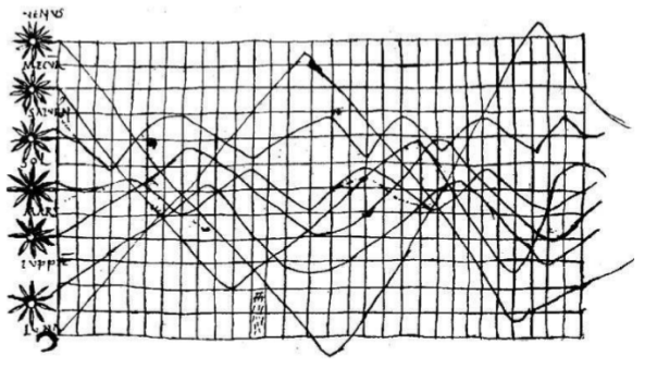
Planetary movements were shown as cyclic inclinations over time in this chart created by an unknown astronomer. It appeared in an appendix written in the 10th century to Cicero’s In Somnium Scripionus.
6. A data visualization saved lives in 1854
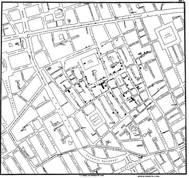
During the London cholera epidemic of 1854, Dr. John Snow, an English physician, used a dot map and statistics to illustrate the cluster of cholera cases and the connection between the quality of the water source and cholera cases in a particular neighborhood. With this data visualization, he could show that two waterworks companies were taking cholera infected water from sewage-polluted sections of the Thames and delivering it to homes, which was causing an increased occurrence of cholera. Snow’s study is regarded as the founding event of the science of epidemiology, and a visualization that had a huge impact on public health and administration.
7. A fascinating visualization of global weather conditions with data since 1981 may be one of the most complex in the world
Earth, by Cameron Beccario, is a complex real-time data visualization project of global weather conditions forecast by supercomputers. It is beautiful, interactive and shows animated visualizations of different conditions like real-time wind speed and direction, ocean currents, ocean and surface temperatures and anomalies in a visually stunning and engaging way. The visualizations use intricate, dramatic swirling patterns to depict the weather conditions, reminiscent of oil paintings of the Impressionists. Considered as one of the most complex visualizations, Earth is a perfect example of how data visualization can be used to showcase complex and large amounts of data pulled from multiple and reliable sources in real-time.
A look at these data visualization statistics, facts, and history can inspire us to create visualizations that will make a real impact, and possibly, remain valuable in posterity.