
Data visualization tools or software play a vital role in enabling organizations to leverage the power of visual data and unlock value from the vast amount of data that’s generated. While some data visualization tools are standalone, others are integrated into a Business Intelligence (BI) platform. If you require advanced BI functionalities such as predictive analytics or forecasting, then you may consider a BI solution. Such a solution will typically include data visualization, as well as analytics, reporting and other functionalities.
What should you look for when you evaluate data visualization tools? The following list will help you to define your own evaluation criteria:
- The tool should have functionalities to represent all kinds of data effectively. A good data visualization tool is intuitive and powerful enough for many different use cases.
- Will the users in your organizations be data science experts or general business users? Will there be a small group of people who can go through a fair amount of training, or do you want the tool to be easily used by many people after just a little training? While some have steep learning curves, there are many other good data visualization tools that have sufficiently simplified interfaces so that users aren’t required to have advanced technical skills.
- How will the data visualization tool integrate into your existing systems and workflows? How will it collect data from various sources, business systems and apps, and deliver visualizations to the stakeholders in the form and on the devices they need? Ideally, it should be possible to integrate the data visualization tool into your existing systems and workflows easily.
- A very important consideration today is whether you require reports for mobiles. Do you plan to work extensively with visualizations on mobile devices? If yes, then you need to evaluate how well your available choices deliver on this ability.
- If tracking trends is important for your business, then the data visualization tools should have strong trend tracking functionality.
- Security and access control capabilities, ensuring that your data is secure and only available to authorized persons, are extremely important as well.
After reviewing some market-leading data visualization tools, we’ve listed our 5 top choices below:
1. Tableau: The Tableau platform is a set of analysis and data visualization tools popular with medium to large enterprises. Tableau has 67 native data connectors that make it convenient to collect data from multiple sources — such as databases, spreadsheets, cloud apps like Google Analytics or Salesforce — and create your data set. Tableau enables the sharing of data between desktop and mobile devices very easily, as well as setting access rights for different collaborators.
Tableau allows users to select from several different approaches and create a unique data analysis system. The live visual analytics and interactive dashboard capabilities of Tableau enable users to slice and dice data and arrive at deeper insights. This means that a user can create or analyze a dashboard when in discovery mode, and unearth more insights from the data.
Tableau helps to create interactive maps for analysis across regions and territories. Many users leverage the capabilities of Tableau to weave a data story or a sequence of visualizations. Organizations have customized Tableau to meet industry-specific requirements in banking, education, healthcare, real estate, manufacturing, and technology.
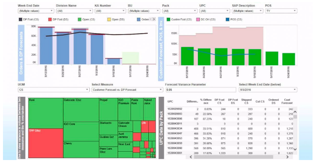
Tableau has been ranked as a leader in the Gartner Magic Quadrant for Analytics and Business Intelligence Platforms for seven consecutive years. Salesforce acquired Tableau in 2019 in order to integrate its analytics and visualization offerings across the Salesforce suite. Some experts believe that Tableau is better suited for data analysts than general business users.
2. Microsoft Power BI: Power BI from Microsoft is a web-based business analytics and data visualization platform that helps to easily analyze, transform, visualize and share data. Power BI is well suited to general business users looking to leverage analytics and data visualization. Power BI collates data from organizational systems and apps, and offers unlimited access to onsite as well as data on the cloud, enabling the creation of a centralized data hub.
Power BI is designed to create data visualizations faster, and it allows general business users to get powerful data analytics and discovery without prior technical knowledge. The real-time data access of Power BI enables users to respond to business changes coming from CRM, project management, sales, and financial tools.
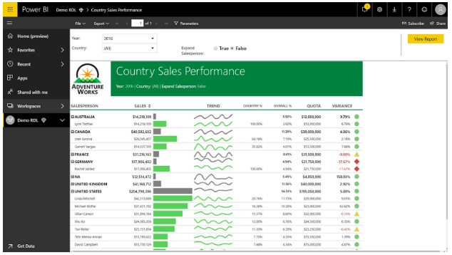
Power BI is convenient for users of Microsoft products such as Azure, Office 365 and Excel. This data visualization tool easily integrates with many third-party software, such as GitHub, Zendesk, and Marketo. It has good web publishing capabilities, so you can import and publish data online to share with collaborators. It comes with SQL Server Analysis Services that help to quickly build reusable models. The natural language query tool is a powerful feature of Power BI. This works similar to Google for your data and you can ask questions like ‘on which expense heads did we go over budget?’ and the tool will respond.
3. Sisense: Sisense is an agile business intelligence (BI) solution based on an analytics database that they call ElastiCubes. ElastiCubes enables users to bring in data from multiple sources, and then merge, manipulate, and query the data as if it was one consolidated data set. Users can then perform slicing and dicing over the complete data set with various filters and analytical tools. Sisense also has dashboards and scorecards functionalities.
Sisense is used by many small to mid-sized organizations to create dashboard applications, standard and enterprise reports, and embedded BI applications.
Sisense uses database technology designed for 64-bit hardware and latest CPU architectures from the ground up, which enables it to deliver at speeds comparable to in-memory BI solutions, without being constrained by data volumes or concurrent usage. Sisense utilizes disk, RAM, and CPU efficiently, so it is able to process terabytes of data on inexpensive hardware, and serve a large number of concurrent users.
4. Zoho Analytics: Zoho Analytics is a business data analytics platform with inbuilt capabilities for creating KPI widgets, pivot tables, and tabular view components. This solution makes it extremely easy for users to embed reports and dashboards in their apps, blogs, and websites. Zoho Analytics enables app developers and independent software vendors to integrate and build reporting and visualization capabilities into their software. Key advantages of Zoho Analytics are its user-friendly dashboard and ease of data integration and accessibility. Customized dashboards can be easily created with the help of Zoho Analytics’ drag-and-drop interface, charts, widgets, and more.
The BI Survey reports that 90% of Zoho Analytics users use this tool for standard or enterprise reporting and dashboard creation.
5. Looker: Looker is a cloud-based BI platform that helps businesses to capture and analyze data from multiple sources and make data-driven decisions. It features a powerful business intelligence platform that lets users utilize SQL to organize unstructured data. Furthermore, Looker utilizes popular data modeling language for impactful visualizations and seamless data consolidation. Users can also create reports instantly, gamify the data analytics journey, and present insights in compact visual aids.
Looker is used for specific business objectives such as supply chain analysis, digital marketing, customer behavior analysis, and distribution process evaluation. Looker has a “view source” functionality to help users understand how the data they are viewing is being manipulated. Customizable charts, graphs, and reports can be included in the dashboards, which can be drilled down to discover information in multiple layers.
Looker has an intuitive interface and workflow that make it easy to navigate. Users can clean, organize and interpret unstructured data without needing to do any complex coding. The self-service features of Looker make the data analytics journey simpler for all types of users. Looker facilitates collaboration through its strong support for any browser and mobile device. Reports and data can also be instantly generated and shared through emails as well as converted into more popular forms such as Google Docs or Excel. Looker has visualization capabilities that are both powerful as well as handy.
Looker is a two time winner of Google Cloud Partner of the Year for Data Analytics.
We looked at 5 data visualization tools here, and there are many others. You may want to look at Periscope Data, Domo, Qlikview, Klipfolio, Kibana, or Plotly as well. Once you have defined which features are most important for your purposes, you can view videos and demos of the options and shortlist those that suit you best. Demos and trial versions will help you discover how well the different options map with your needs and select the right data visualization tool for your business.