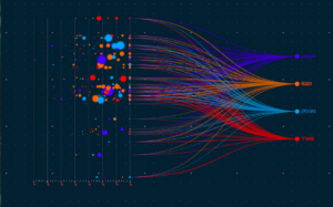
There are many data visualization types that can be used to tell your company’s data story. Storytelling is now recognized as a powerful way to communicate in the business world. In the course of their work, business people turn to expert trainers, workshops, and books to learn how to use the power of storytelling.
Why is storytelling so powerful? As humans, we are different from other species in the way that we try to make meaning of events. Stories are created to narrate events in a way that helps us see a larger meaning in them. That’s why we remember stories even though we have difficulty remembering facts, dates, etc. We love to share stories so that we can share the meaning that we received from them to others. Most stories are about difficulties that need to be overcome, heroic deeds and the courage to face those challenges, and finally a resolution — hopefully one that is happy.
When applying storytelling to business, the objective is often persuasion. We can structure our communication or pitch along the lines of a story. Let’s look at what makes up a story that is persuasive in a business environment. How can various types of data visualization help to create that story or bring it to life?
When visualizations and dashboards are strung together into a narrative arc they provide the audience a series of thoughts that can be followed in a clear and compelling way — sometimes called a data story. These data stories can be used across all industries and are particularly effective for discussing data analytics for strategic decisions, conference presentations, sales meetings and more.
What’s the difference between a data visualization and a story?
A data visualization helps viewers to explore data but does not present a specific point of view. On the other hand, a data story is used when the researcher has already found certain patterns that she would like to highlight to the audience. She now uses a sequence of data visualizations in order to lead viewers through a tour of the data, with a view of reaching a specific destination.
How data visualizations tell a story that helps a retail chain make data-driven decisions
Let’s consider an example of a retail chain looking to add more services at each retail outlet based on customer needs. The company conducts a customer survey which shows the socio-economic distribution of the residential areas where different outlets are located, buyer behavior at various outlets, and additional services desired based on location and socio-economic factors. When the research team needs to present this study to stakeholders and decision-makers, storytelling can help everybody see trends, share reasoning, and arrive at a consensus.
The first visualization in the story could show the location of different outlets on a map along with the income distribution as a histogram. The outlets plotted on a map based on geolocation could be grouped into different income strata and color-coded accordingly. In this way, the presenter has set the stage for the data story by helping all stakeholders to see locations and socio-economic data.
In the next visualization, she could show the average purchase value for each income band at each location. This can lead to discussions, such as why buyers of a certain income profile are spending more at certain locations and less at others. How can the outlet where they are currently spending less better serve those buyers? Which locations and which income profiles are the most valuable for the company? What differentiated strategies are required based on socio-economic groups?
Next, we have the consumer responses to a survey where respondents have been asked what additional services they would like to have at the outlets. These responses, seen by location and income bands — and in light of previous discussions about spending habits — provide a range of insights. Which additional services are needed by consumers who are already spending the most at our outlets? Or which additional services may motivate low spending consumers to shop more with us? Are certain services required more in certain locations? For example, we may find that buyers from a particular locality say they need an ATM machine at an outlet because there isn’t one conveniently available in their neighborhood.
This data story, made up of a sequence of visualizations, is extremely valuable for decision-makers to discuss which new services added at what locations will help add the most revenues. More importantly, this data story can prevent the company from investing in facilities and services that will not be perceived as valuable by consumers and will not generate optimum returns. Various types of data visualization such as heat maps, scatter plots, bubble charts, histograms and pie charts can be used to bring out each aspect of this story.
How to use storytelling with data visualizations
You can apply the power of storytelling in data visualizations with the right planning, techniques, tools, and structure. Start by considering in what situations storytelling with data visualizations will serve you best. Consider your audience; are they senior executives who are more likely to look at the bigger picture or are they managers focused on detail and practical aspects? Once you have considered these aspects you can move on to storytelling using the following structure and elements:
- Plot: What is the starting point, the journey, and where do you want to take your audience? Once you have an idea of this plot structure, you can think about what data is needed to help stakeholders traverse the path.
- Characters: You can think about the data sets, filters, and parameters as characters in your story. You may want to use a map to provide the geographical context to your characters. Numbers also require a context to make sense. For example, you may share industry benchmarks when you present numerical data.
In some stories, there could be a ‘villain’, or a particular problem or challenge. For example, if your data story is related to public health, the villain could be an epidemic. By setting the stage for the story, introducing the characters and the potential harm that the villain could do, you create a certain tension. Your audience is now engaged with the rest of your presentation, seeking resolution of the tension.
- Storyboard: With these elements in place, you can plan what data you need to present and in what sequence. Now you should plan the stages or ‘plot points’ of your story.
- Presentation: Select the types of data visualization that best suit the data, the audience, and the journey. Are you looking to understand the distribution of data and look for outliers? Do you need to compare multiple values or analyze a single value over time? Choose an appropriate visual display that will eliminate clutter and focus attention where you want it.
In addition to the visual data, you will also need to plan the narration that will accompany it.
- The resolution: Hopefully a happy ending! Your data visualizations will help your audience find the hidden cause of a phenomenon or the solution to a challenge. As different people have made the same journey, it is easier to reach consensus and arrive at data-driven decisions.
Storytelling with different types of data visualization has applications in many fields. We saw an example related to retail. A similar methodology could be used for public planning. Let’s say we’re looking at different regions in a state or country, and we need to understand employment, gross regional product by region over a period of 5 years, and underlying causes. The data story will help us to see whether a particular region is becoming more or less affluent. As the change in gross regional product is easily visible over a timeline, it becomes very apparent if a region that was performing well has started doing poorly. We can pinpoint the time when this happened and search for possible causes or correlations.
In sports, teams can use visualization to understand how the performance of individual players is linked to physical attributes like weight or height. In financial services, lenders can see the profile of loan applicants based on various parameters such as residential area, income, age, and education. These results can be seen in conjunction with the profile of customers who have been conscientious borrowers. Applicants that match the best borrower profiles could be offered some additional benefits, or their applications could be fast-tracked.
These are just some of the ways storytelling with data visualizations can help organizations make data-driven decisions with a greater chance of success.


