
An important component to big data management is transforming your analytics into a visual representation that can be easily digested by stakeholders. Data visualization can be a powerful tool that has a strong impact. Unfortunately, there are also a number of ways in which data visualization can go awry.
There have been numerous examples of data visualization fails leading to disaster, including recently a confusing chart design for an OECD study on job automation that caused media coverage to misinterpret and misrepresent the results of the study.
To help your company avoid these visualization blunders, we’ve put together a list of 3 data visualization practices to avoid.
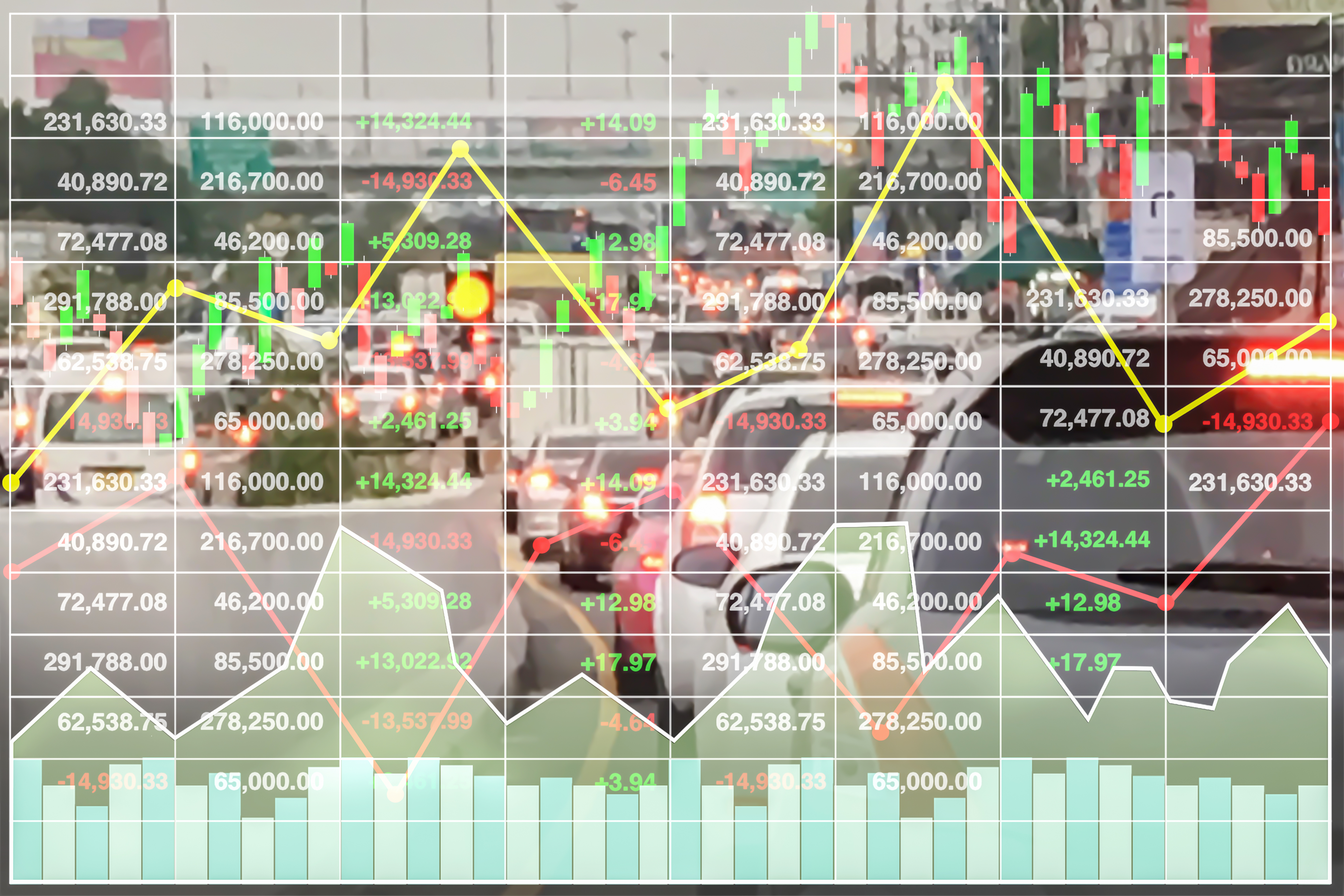
Too much detail
When you are the one presenting data, you are presumably the expert on the information and have a deep understanding of the facts that support the graphics. In an attempt to demonstrate your wealth of knowledge, it might be tempting to throw as many details as possible into your visuals. However, with graphics there really can be too much of a good thing. Too many layers of information and visuals lead to confusion or frustration on the part of the viewer.
Wrong graphic for the data
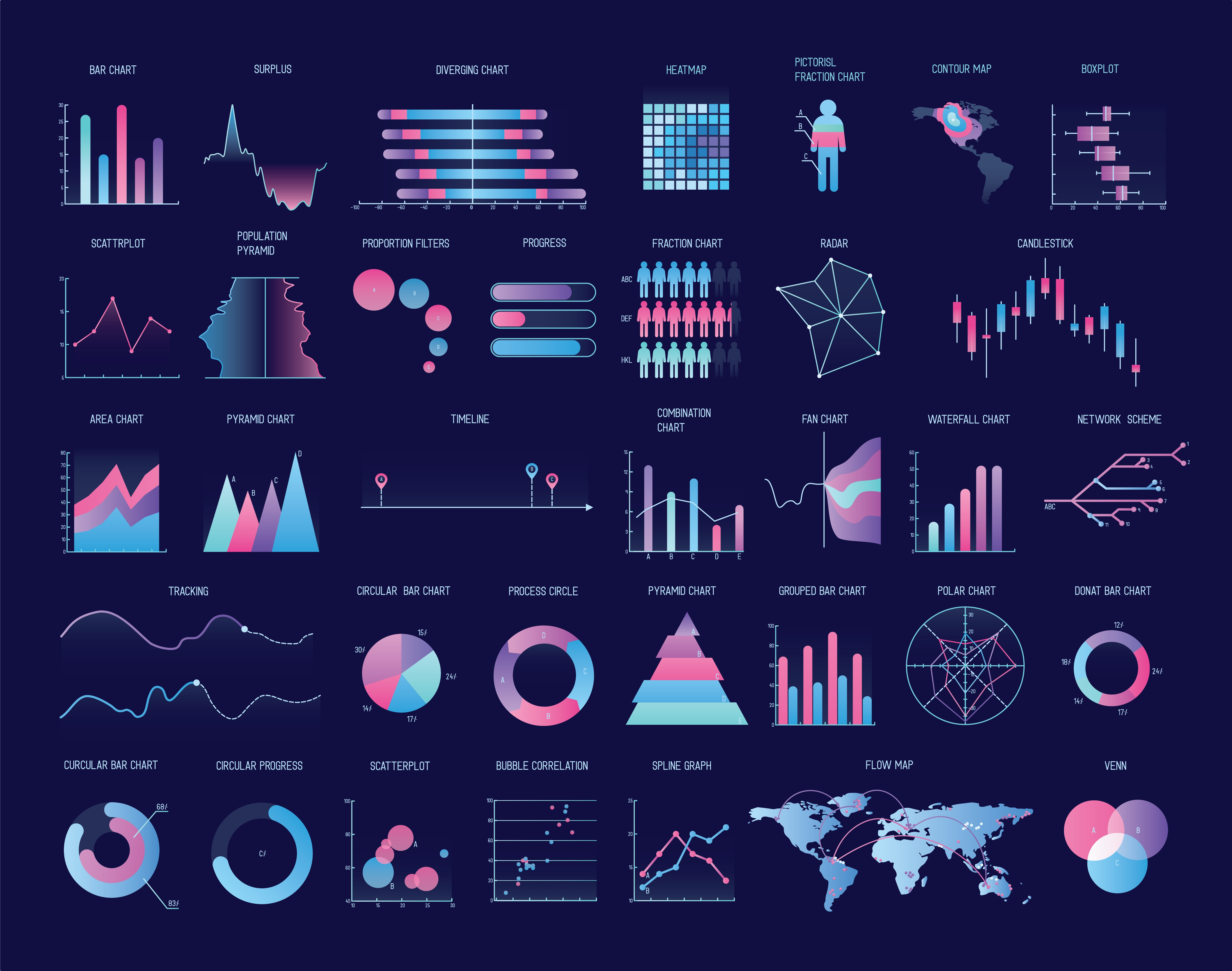
From bar graphs, to pie charts, to linear representations, each type of visual graphic has its own specific strengths and purpose. For example, bar graphs are best suited to display different categories or rankings. Meanwhile, pie charts are effective in representing percentages for data with less than 6 categories.
If you’re uncertain how to choose the right kind of graphic for your data, check out the free chart chooser on extremepresentation.com or utilize a company to produce professional data visualization such as Treehouse Technology Group.
Forgetting your math
When the numbers in your visual do not add up, readers doubt their eyes and question your analysis. So always be sure to check your arithmetic. For instance, the most common mistake in pie charts is having components that do not add up to 100 percent.
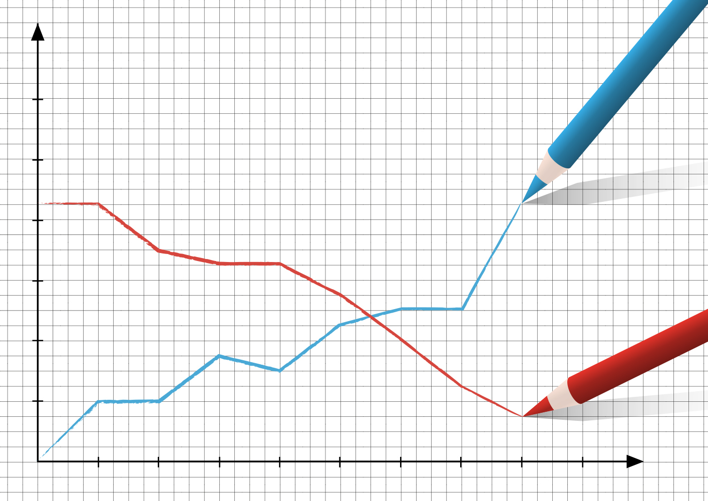
Most visuals or graphs have an intrinsic logic we should use to our advantage. For example, a line chart that shows progression over time on the X-axis will make intuitive sense to viewers. A graph in which the timeline reaches upward vertically instead is much harder to interpret and understand.
In conclusion
Following these tips will help you avoid major data visualization blunders. However, to produce perfect results, utilize development services from a company such as Treehouse Technology Group that will create a professional visualization of your data. Companies like Treehouse Technology Group are also highly effective in creating visual dashboards that allow companies to make informed business decisions based on dashboard insights. For more information on Treehouse Technology Group and its services visit their website.