Data visualization is the representation of data in visual formats that incorporate charts, graphs and a variety of other illustrations. With the help of images, data visualization highlights relationships within the data and is a powerful tool for making complex and large amounts of data easy to comprehend.
Interactivity is a feature of modern data visualizations that was not possible in traditional, static charts or graphs that were meant simply to be viewed. Today, interactive data visualization delivers information that users can manipulate to find specific insights they need to know.
Let’s dive into a few examples of interactive data visualization.
The interactive data visualization, WorldBank Contract Awards, used to make the following example is from http://d3.artzub.com/wbca/ and is created by Artem Zubkov.
WorldBank Contract Awards
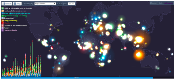
Here you can see a data visualization of the World Bank’s Major Contract Awards dataset, which serves as a guide to the distribution of major contract commitments among the Bank’s member countries, with a timeline that shows the progression from the past to the present.
• Each luminous particle is a contract. It moves from supplier to borrower.
• The size of the particle depends on the contract amount.
• Each node of the country gathers contracts which it borrowed.
• Every second in the progress of the timeline represents a moving forward by a day.
• The histogram shows the number of contracts per day, separated by a selected criterion.
• The legend shows the number of contracts for all time separated by a selected criterion.
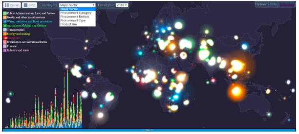
In the image below, a menu bar at the top of the interface, where you can either pause or stop the visualization, can be seen. While it is set on play by default, you can also select the sector for which you want to view data on, such as major sector, procurement category, procurement method, procurement type or product line.
Under each sector, you have further data classifications of the contracts being visualized (on the top left). They are classified into eight categories which you can select to view. On the top, you can select the year for which you want to view data and you can also see the current year. Finally, on the bottom, you can see the exact date through the blue timeline.
When you explore this visualization further, you can isolate a particular category or dataset by selecting or simply hovering above that particular category from the list on the top left of the screen. You can see the total amount of contracts awarded on a given date, as well as the direction of movement of contracts between locations from the supplier to the borrower.
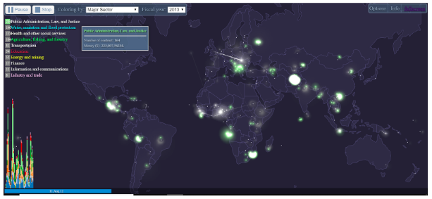
Selected above is data visualized for the category: Public Administration, Law, and Justice. You can see how 164 contracts relating to Public Administration, Law, and Justice were procured on the 11th of August in the year 2013, as visible from the date on the slider at the bottom of the screen. You can see from the intensity of the color (light green) how Angola and Afghanistan had more contracts awarded than other countries,, and you can also see how there were other contracts going on in Africa, Europe, Asia, and South America at the same time. From this visualization, you can also see how Australia had virtually no contract on this given day.
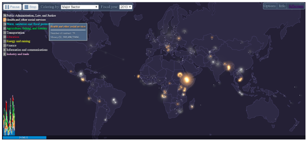
Next, for the health and other social services category selected above, you can see how 75 contracts relating to health and other social services were procured on the 24th of July in the year 2013. You can also see from the intensity of the color (orange) how Ethiopia had more contracts awarded than other countries, even though several African countries also carried out a lot of contracts on the said date. You can also see a faint streak coming from North America which represents a contract from a supplier to a borrower in Africa.
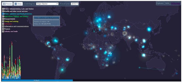
In the category of water, sanitation and flood protection selected above, you can see how contracts relating to them were procured on the 4th of September in the year 2013 as on the timeline on the bottom. You can find that, based on the intensity of the color (blue), Africa, in general, had more contracts awarded, and that Europe had the majority of suppliers for such contracts. You can also see faint streaks moving in all directions which shows the different directions of contract movements between suppliers and borrowers on that date.
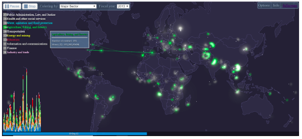
Moving on, you can see how contracts relating to agriculture, fishing and forestry were procured on the 19th of September in the year 2013. You can see from the intensity of the color (green) how Asia this time around had more contracts awarded, with Africa having the second most contracts and Europe, the third. You can also see faint streaks moving between Europe and America which shows the directions of contract movements between suppliers and borrowers.
This highly detailed data visualization that shows and interprets data from large sets in a simple, interactive way also has further categories like Transportation, Energy and Mining, Education, Information and Communications, Finance, and Industry and Trade. It presents visualizations for the World Bank’s Major Contracts Awards dataset in these categories and enables analysis and insights based on this data.
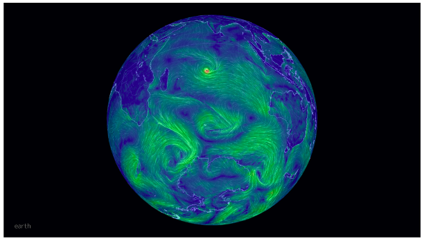
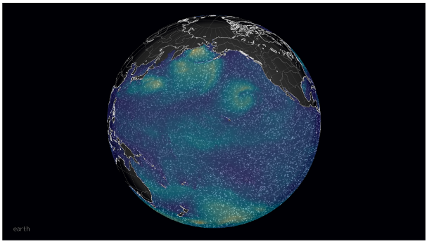
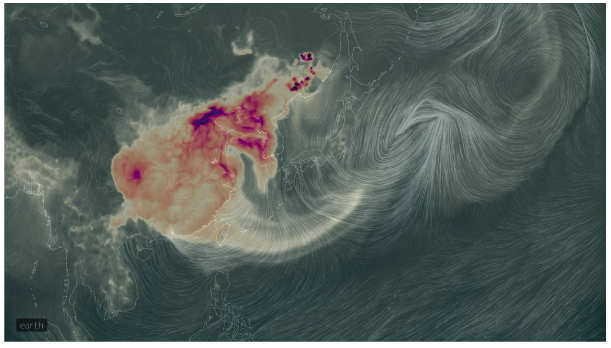
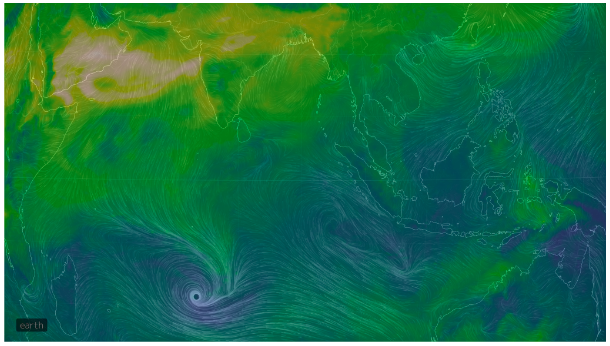
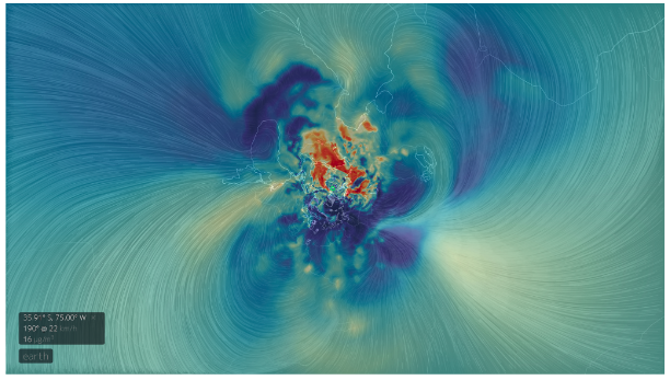
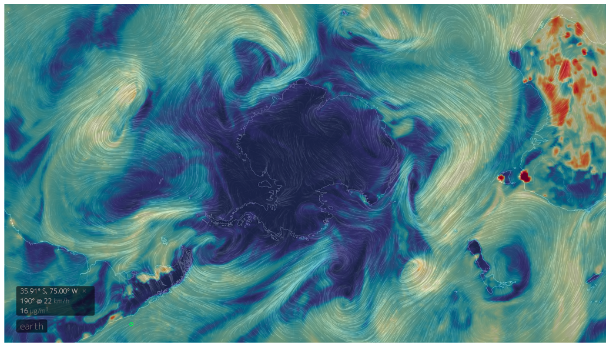
Earth, by Cameron Beccario
Earth (https://earth.nullschool.net/), by Cameron Beccario, is another fascinating interactive visualization of global weather conditions with data since 1981. It may also be one of the most complex data visualizations in the world.
Earth is a complex, real-time data visualization project of global weather conditions forecast by supercomputers. It is beautiful, interactive and shows animated visualizations of different conditions, such as real-time wind speed and direction, ocean currents, ocean and surface temperatures and anomalies in a visually stunning and engaging way.
The visualizations use intricate, dramatic swirling patterns to depict the weather conditions, reminiscent of oil paintings of the Impressionists. The project intersects science, data, and computer engineering, and art to create mesmerizing visualizations of complex data sets. In fact, since it launched, some artists have incorporated its wind map imagery into their own artwork.
Considered one of the most complex visualizations, Earth is a perfect example of how data visualization can be used to showcase complex and large amounts of data pulled from multiple and reliable sources in real-time. The fact that this dynamic map is interactive means that you can explore by yourself exactly what the weather conditions — wind speed and direction, cloud cover and ocean currents — are anywhere on Earth.
A look at these data visualization statistics, facts, and history can inspire us to create visualizations that will make a real impact, and possibly, remain valuable in posterity.
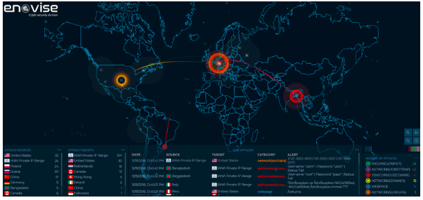
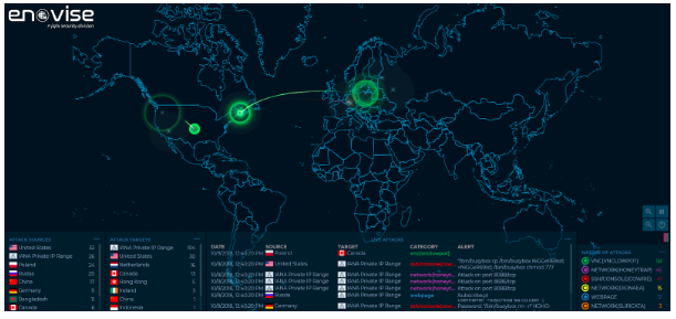
ENOVISE CYBER THREAT INTELLIGENCE (ECTI)
http://works.artzub.com/enovise_map/
Envoise, by Artem Zubkov, collects, analyzes and correlates live data and cyber threat intelligence from a honeypot infrastructure with hundreds of sensors deployed in different countries across Africa and other parts of the world. It shows information on the source of the cyberattack, the region of the attack target, and the category and nature of the cyber attack on a given day. The attacks shown on the map are based on only a small subset of live flows against the creators’ infrastructure, demonstrating live actual attacks by the different cyber threat actors. Envoise has the capability to capture the attack origins and target nature since they are received in real-time. This makes it possible to conduct a deep dive analysis into each and every single event as it unfolds.
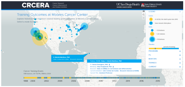
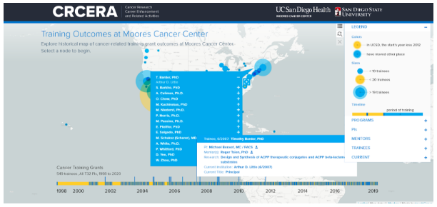
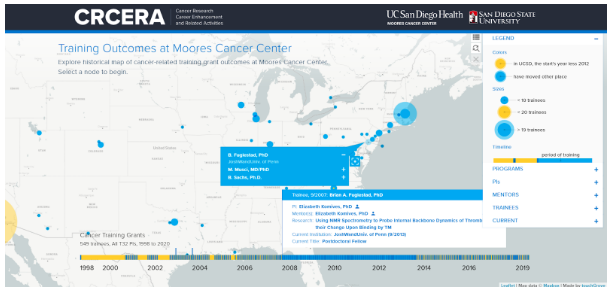
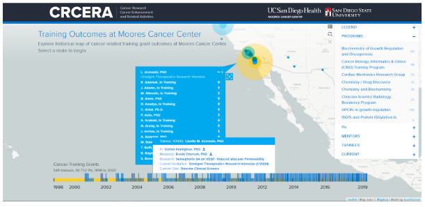
Training Outcomes at Moores Cancer Center
Another interesting example of an interactive data visualization is the one created for Training Outcomes at the Moores Cancer Center, University of California, San Diego and San Diego State University map, created by touchGrove. With this interactive data visualization you can explore the historical map, from 1998 to present-day, of cancer-related training grant outcomes at Moores Center. It has a record of all the 549 trainees working in research programs and all T32 Principal Investigators directing research projects, which are an outcome of grants at Moores Cancer Center from 1998 to 2020. On a world map, you can see nodes of different colors and sizes that denote the following:
- Colors
- Light brown – in UCSD, the start’s year less 2012
- Blue – have moved other place
- Sizes
- Small < 10 trainees
- Mid size < 20 trainees
- Large > 19 trainees
When you hover your mouse over a particular node on the world map, it will show you all the details of the trainees who are working there, the program, the name of the PI directing the program, the mentors, the name of the research institute, current titles of the researchers, universities involved, etc. This way of documenting where all the researchers work and what they are working on is quite incredible and allows us to create a valuable bank of information about all the past research programs around the world.
The above examples of interactive data visualizations capture the power and effectiveness of synthesizing large amounts of complex data into a visual that can be easily used and understood. They are a powerful tool, ultimately allowing businesses to form significant insights that lead to better decision-making.